# packages
library(galah)
library(dplyr)
library(ggplot2)
library(tidyr)
library(janitor)
galah_config(email = "your-email-here") # ALA-registered email

birds <- galah_call() |>
  filter(doi == "https://doi.org/10.26197/ala.0e60416d-d9e5-4bf2-a0dc-f0c26ae9105a") |>
atlas_occurrences()2 Summarise
In the previous chapter, we learned how to get an overview of our data’s structure, including the number of rows, the columns present, and any missing data. In this chapter, we will focus on summarising ecological data across three key domains: taxonomic, spatial, and temporal. Summarising data can provide insight into the scope and variation in our dataset, and help in evaluating its suitability for our analysis.
Where possible, we will use the galah package to summarise data. galah can summarise data on the server-side before they are downloaded, enabling you to filter or summarise the data without needing to have them on your local computer first. We will demonstrate how to use galah (prior to download) or other suitable cleaning packages (after a download) when both options are available.
2.0.1 Prerequisites
In this chapter, we will use occurrence records for Alcedinidae (Kingfishers) in 2023 from the ALA.

2.1 Taxonomic
2.1.1 Counts
Prior to downloading data, it can be useful to see a taxonomic breakdown of the occurrence records that exist for our query. For example, with the Alcedinidae dataset, we can count the total number of occurrence records…
galah_call() |>
  identify("alcedinidae") |>
  filter(year == 2022) |>
  atlas_counts()
# A tibble: 1 × 1
count
<int>
1 143981…or group by a taxonomic rank like genus…
galah_call() |>
  identify("alcedinidae") |>
  filter(year == 2022) |>
  group_by(genus) |>
  atlas_counts()
# A tibble: 6 × 2
genus count
<chr> <int>
1 Dacelo 94523
2 Todiramphus 41928
3 Ceyx 6121
4 Tanysiptera 919
5 Syma 366
6 Alcedo 21…or species.
galah_call() |>
  identify("alcedinidae") |>
  filter(year == 2022) |>
  group_by(species) |>
  atlas_counts()
# A tibble: 11 × 2
species count
<chr> <int>
1 Dacelo novaeguineae 86999
2 Todiramphus sanctus 26562
3 Todiramphus macleayii 10139
4 Dacelo leachii 7519
5 Ceyx azureus 5439
6 Todiramphus chloris 2696
7 Todiramphus pyrrhopygius 2410
8 Tanysiptera sylvia 919
9 Ceyx pusillus 682
10 Syma torotoro 366
11 Alcedo atthis 19Our results show that the large majority of records are of Dacelo novaeguineae (aka the Laughing Kookaburra).
You can get the same summaries after downloading the data locally using dplyr or janitor.
# Using our pre-downloaded dataset
birds |>
  group_by(genus) |>
  count() |>
  arrange(desc(n))
# A tibble: 6 × 2
# Groups: genus [6]
genus n
<chr> <int>
1 Dacelo 94027
2 Todiramphus 41640
3 Ceyx 6063
4 Tanysiptera 911
5 Syma 358
6 <NA> 121birds |>
group_by(species) |>
count() |>
arrange(desc(n))# A tibble: 11 × 2
# Groups: species [11]
species n
<chr> <int>
1 Dacelo novaeguineae 86558
2 Todiramphus sanctus 26399
3 Todiramphus macleayii 10054
4 Dacelo leachii 7464
5 Ceyx azureus 5388
6 <NA> 2896
7 Todiramphus pyrrhopygius 2386
8 Tanysiptera sylvia 911
9 Ceyx pusillus 675
10 Syma torotoro 358
11 Todiramphus chloris 31# Using our pre-downloaded dataset
birds |>
tabyl(genus) |>
adorn_pct_formatting() genus n percent valid_percent
Ceyx 6063 4.2% 4.2%
Dacelo 94027 65.7% 65.8%
Syma 358 0.3% 0.3%
Tanysiptera 911 0.6% 0.6%
Todiramphus 41640 29.1% 29.1%
<NA> 121 0.1% -birds |>
tabyl(species) |>
adorn_pct_formatting() species n percent valid_percent
Ceyx azureus 5388 3.8% 3.8%
Ceyx pusillus 675 0.5% 0.5%
Dacelo leachii 7464 5.2% 5.3%
Dacelo novaeguineae 86558 60.5% 61.7%
Syma torotoro 358 0.3% 0.3%
Tanysiptera sylvia 911 0.6% 0.6%
Todiramphus chloris 31 0.0% 0.0%
Todiramphus macleayii 10054 7.0% 7.2%
Todiramphus pyrrhopygius 2386 1.7% 1.7%
Todiramphus sanctus 26399 18.4% 18.8%
<NA> 2896 2.0% -
2.2 Spatial
2.2.1 Counts by region
It can be useful to summarise occurrence numbers by a specific region. With galah, you can do this summarising prior to downloading occurrence records.
For example, you might wish to summarise your data by state/territory. We can search for the correct field to use in galah, determining that field ID cl22 contains “Australian States and Territories” and seems to suit our needs best.
search_all(fields, "states")# A tibble: 6 × 3
id description type
<chr> <chr> <chr>
1 cl2013 ASGS Australian States and Territories fields
2 cl22 Australian States and Territories fields
3 cl927 States including coastal waters fields
4 cl10925 PSMA States (2016) fields
5 cl11174 States and Territories 2021 fields
6 cl110925 PSMA States - Abbreviated (2016) fieldsNow we can use the field ID cl22 to group our counts.
galah_call() |>
  identify("alcedinidae") |>
  filter(year == 2022) |>
  group_by(cl22) |>
  atlas_counts()
# A tibble: 8 × 2
cl22 count
<chr> <int>
1 Queensland 51503
2 New South Wales 40179
3 Victoria 24012
4 Northern Territory 9963
5 Western Australia 7951
6 Australian Capital Territory 3534
7 Tasmania 2545
8 South Australia 2525We can also group our counts by state/territory and a taxonomic rank like genus.
galah_call() |>
  identify("alcedinidae") |>
  filter(year == 2022) |>
  group_by(cl22, genus) |>
  atlas_counts()
# A tibble: 27 × 3
cl22 genus count
<chr> <chr> <int>
1 Queensland Dacelo 27621
2 Queensland Todiramphus 19856
3 Queensland Ceyx 2671
4 Queensland Tanysiptera 918
5 Queensland Syma 364
6 New South Wales Dacelo 30797
7 New South Wales Todiramphus 7843
8 New South Wales Ceyx 1528
9 New South Wales Alcedo 2
10 Victoria Dacelo 19714
# ℹ 17 more rowsOur results show that we have the most records in Queensland and New South Wales.
You can get the same summaries after downloading the data locally with dplyr and janitor.
# Using our pre-downloaded dataset
birds |>
  group_by(cl22) |>
  count() |>
  arrange(desc(n))
# A tibble: 9 × 2
# Groups: cl22 [9]
cl22 n
<chr> <int>
1 Queensland 51131
2 New South Wales 39909
3 Victoria 23959
4 Northern Territory 9889
5 Western Australia 7882
6 Australian Capital Territory 3529
7 South Australia 2548
8 Tasmania 2508
9 <NA> 1765birds |>
group_by(cl22, species) |>
count() |>
arrange(desc(n))# A tibble: 59 × 3
# Groups: cl22, species [59]
cl22 species n
<chr> <chr> <int>
1 New South Wales Dacelo novaeguineae 30602
2 Queensland Dacelo novaeguineae 24253
3 Victoria Dacelo novaeguineae 19667
4 Queensland Todiramphus sanctus 10384
5 New South Wales Todiramphus sanctus 6963
6 Queensland Todiramphus macleayii 6501
7 Western Australia Dacelo novaeguineae 4011
8 Victoria Todiramphus sanctus 3758
9 Queensland Dacelo leachii 3186
10 Northern Territory Todiramphus macleayii 3166
# ℹ 49 more rows# Using our pre-downloaded dataset
birds |>
tabyl(cl22) |>
adorn_pct_formatting() cl22 n percent valid_percent
Australian Capital Territory 3529 2.5% 2.5%
New South Wales 39909 27.9% 28.2%
Northern Territory 9889 6.9% 7.0%
Queensland 51131 35.7% 36.2%
South Australia 2548 1.8% 1.8%
Tasmania 2508 1.8% 1.8%
Victoria 23959 16.7% 16.9%
Western Australia 7882 5.5% 5.6%
<NA> 1765 1.2% -birds |>
tabyl(cl22, species) |>
adorn_pct_formatting() cl22 Ceyx azureus Ceyx pusillus Dacelo leachii
Australian Capital Territory 4900.0% 0.0% 0.0%
New South Wales 151500.0% 0.0% 0.0%
Northern Territory 94300.0% 11200.0% 307100.0%
Queensland 209000.0% 55300.0% 318600.0%
South Australia 300.0% 0.0% 0.0%
Tasmania 2200.0% 0.0% 0.0%
Victoria 52500.0% 0.0% 0.0%
Western Australia 16500.0% 0.0% 116900.0%
<NA> 7600.0% 1000.0% 3800.0%
Dacelo novaeguineae Syma torotoro Tanysiptera sylvia Todiramphus chloris
283900.0% 0.0% 0.0% 0.0%
3060200.0% 0.0% 0.0% 900.0%
0.0% 0.0% 0.0% 0.0%
2425300.0% 35600.0% 91000.0% 200.0%
188800.0% 0.0% 0.0% 0.0%
246100.0% 0.0% 0.0% 0.0%
1966700.0% 0.0% 0.0% 0.0%
401100.0% 0.0% 0.0% 1300.0%
83700.0% 200.0% 100.0% 700.0%
Todiramphus macleayii Todiramphus pyrrhopygius Todiramphus sanctus NA_
0.0% 0.0% 64100.0% 0.0%
34600.0% 25200.0% 696300.0% 22200.0%
316600.0% 76200.0% 146400.0% 37100.0%
650100.0% 75800.0% 1038400.0% 213800.0%
0.0% 28900.0% 36500.0% 300.0%
0.0% 0.0% 2500.0% 0.0%
0.0% 800.0% 375800.0% 100.0%
0.0% 31500.0% 218200.0% 2700.0%
4100.0% 200.0% 61700.0% 13400.0%
2.2.2 Maps
We can use maps to visualise summaries of our data. To illustrate, we will use the sf package to handle spatial data, and the ozmaps package to get maps of Australia (as vector data).
library(sf)
library(ozmaps)
There are a few occurrence records in our birds dataset that are outside of Australia. For simplicity, we will filter our data to records within Australia’s land mass.
# filter records to within Australia
birds_filtered <- birds |>
  filter(decimalLongitude > 110,
         decimalLongitude < 155,
         decimalLatitude > -45,
         decimalLatitude < -10)
Our first step is to get a map of Australia from the ozmaps package. We will transform its Coordinate Reference System (CRS)1 projection to EPSG:4326 to match the CRS projection of ALA data2.
# Get map of australia, and transform projection
aus <- ozmaps::ozmap_states |>
  st_transform(crs = st_crs(4326))
Then we can plot our occurrence points onto our map.
Point maps are quick and effective ways to visually inspect the locations of your occurrence records. Here we have also adjusted the size and alpha values to make the points larger and more transparent.
# Plot the observations on our map of Australia
ggplot() +
  geom_sf(data = aus,
          colour = "grey60",
          fill = "white") +
  geom_point(data = birds_filtered,
             aes(x = decimalLongitude,
                 y = decimalLatitude),
             colour = "#428afe",
             size = 1.8,
             alpha = 0.6) +
  theme_void()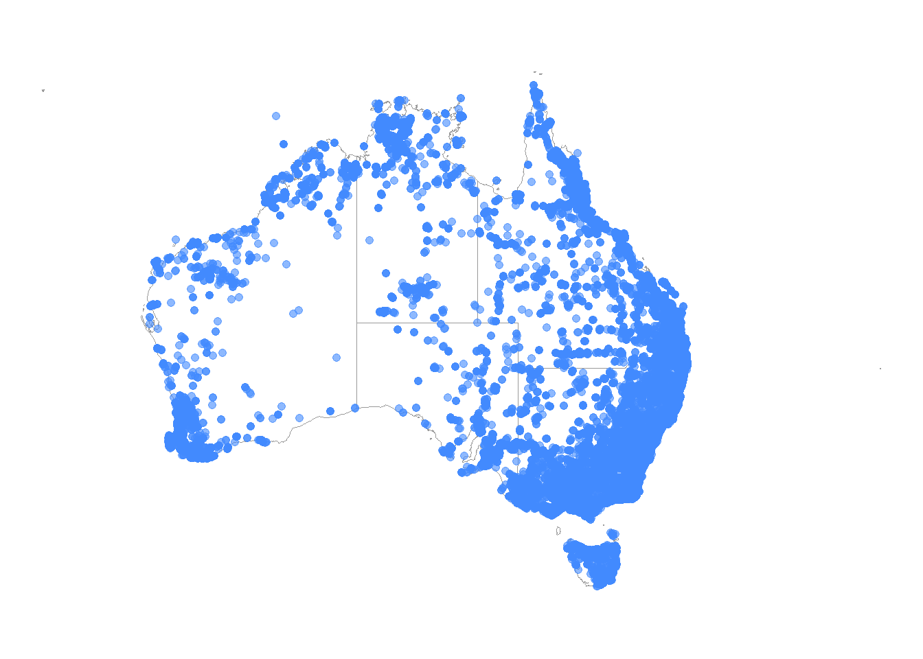
We can use the ggpointdensity package to visualise locations with many overlapping occurrences. With over 40,000 points plotted on our map, geom_pointdensity() allows us to see areas with higher densities of observations.
library(ggpointdensity)
library(viridis) # colour palette

ggplot() +
  geom_sf(data = aus,
          colour = "grey60",
          fill = "white") +
  geom_pointdensity(data = birds_filtered,
             aes(x = decimalLongitude,
                 y = decimalLatitude),
             size = 1.8,
             alpha = 0.6) +
  scale_colour_viridis_c(option = "F",     # palette
                         end = .8,         # final light colour value
                         direction = -1) + # reverse light-to-dark
  guides(
    colour = guide_colourbar(
      title = "Number of\noverlapping\nobservations")
    ) +
  theme_void()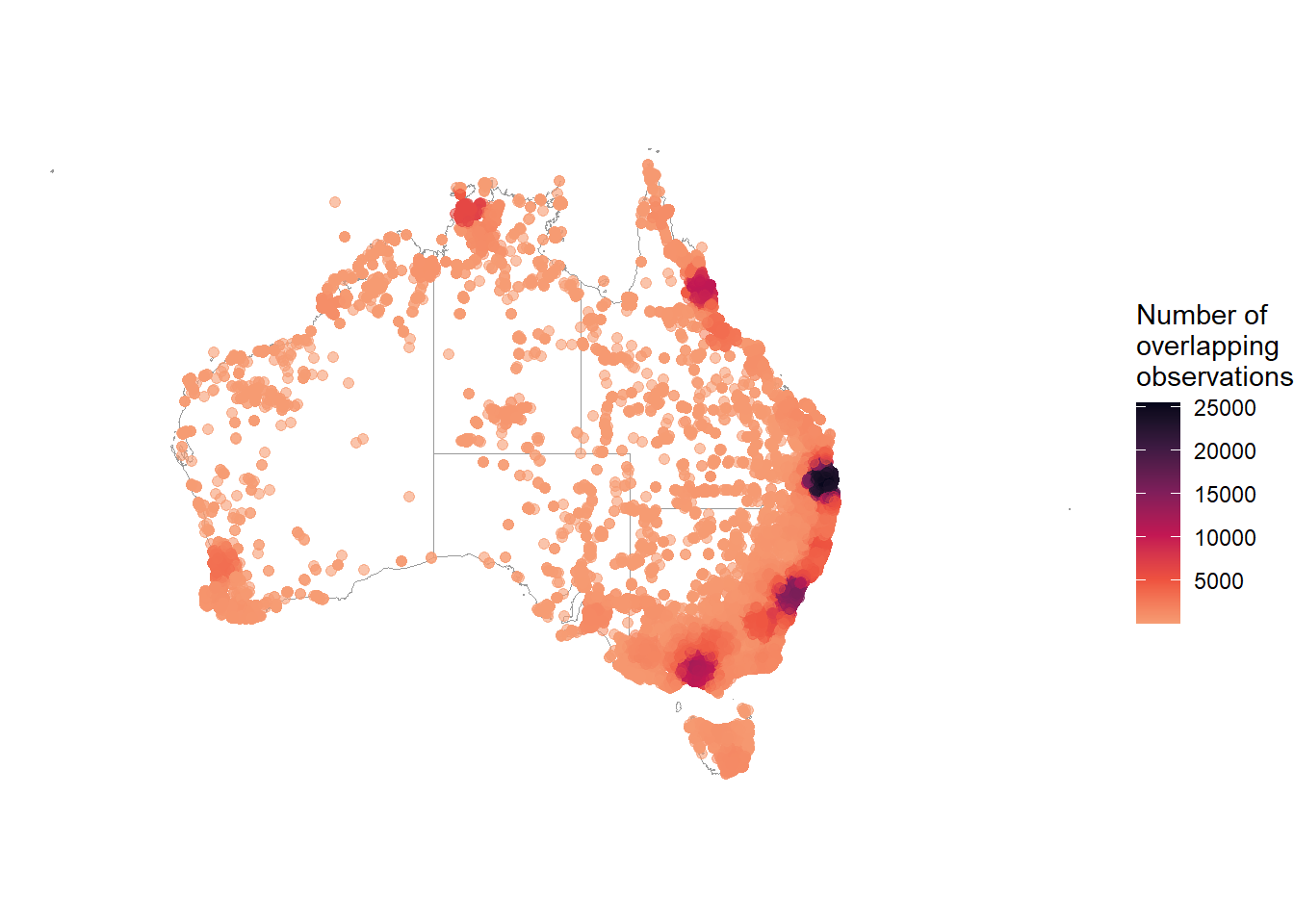
It can also be useful to create a collection of maps grouped by a specific variable (i.e., facetted). Here is one taxonomic example, grouping by species with facet_wrap(). Visualising by groups can reveal spatial trends, and also help you determine whether there is enough data for each species or taxonomic group for your later analyses.
ggplot() +
  geom_sf(data = aus,
          colour = "grey60",
          fill = "white") +
  geom_point(data = birds_filtered |>
               drop_na(species), # remove NA values
             aes(x = decimalLongitude,
                 y = decimalLatitude,
                 colour = species),
             size = 1.8,
             alpha = 0.6) +
  pilot::scale_color_pilot() +
  theme_void() +
  facet_wrap( ~ species) +
  theme(legend.position = "none")
2.3 Temporal
2.3.1 Counts by time scales
Understanding the distribution of when observations are recorded can reveal seasonal trends among species. Checking this distribution can also help you determine whether you have enough data to infer patterns over different time spans—such as a week, month, year, decade, or even century—or whether your inferences about temporal trends are limited by the available data.
Year
For example, an easy first summary is to know the number of records in each year. You can do this in galah prior to downloading data. We can search for the correct field to use in galah, determining that field ID year seems to suit our needs best.
search_all(fields, "year")# A tibble: 8 × 3
id description type
<chr> <chr> <chr>
1 year Year fields
2 raw_year Year (unprocessed) fields
3 endDayOfYear End Day Of Year fields
4 startDayOfYear Start Day Of Year fields
5 occurrenceYear Date (by year) fields
6 raw_endDayOfYear <NA> fields
7 raw_startDayOfYear <NA> fields
8 namePublishedInYear Name Published In Year fieldsNow we can use the field ID year to group our counts, returning years 2016 and onwards.
galah_call() |>
  identify("alcedinidae") |>
  filter(year > 2016) |>
  group_by(year) |>
  atlas_counts()
# A tibble: 10 × 2
year count
<chr> <int>
1 2024 191874
2 2023 178558
3 2022 143981
4 2021 130459
5 2025 129816
6 2020 110027
7 2018 96955
8 2019 95498
9 2017 79823
10 2026 2104Alternatively, you can use the lubridate package to summarise after downloading counts.
We’ll convert our column eventDate to a date class in R. Then we can extract relevant date data…
# Using our pre-downloaded dataset
library(lubridate)

birds_date <- birds |>
  mutate(eventDate = date(eventDate), # convert to date
         year = year(eventDate),      # extract year
         month = month(eventDate,     # extract month
                       label = TRUE))

birds_date |>
  select(scientificName, eventDate, year, month)
# A tibble: 143,120 × 4
scientificName eventDate year month
<chr> <date> <dbl> <ord>
1 Dacelo (Dacelo) novaeguineae 2022-04-19 2022 Apr
2 Dacelo (Dacelo) novaeguineae 2022-12-25 2022 Dec
3 Dacelo (Dacelo) novaeguineae 2022-10-27 2022 Oct
4 Dacelo (Dacelo) novaeguineae 2022-01-23 2022 Jan
5 Dacelo (Dacelo) novaeguineae 2022-11-09 2022 Nov
6 Todiramphus (Todiramphus) sanctus 2022-02-05 2022 Feb
7 Todiramphus (Todiramphus) sanctus 2022-11-24 2022 Nov
8 Dacelo (Dacelo) novaeguineae 2022-10-01 2022 Oct
9 Dacelo (Dacelo) novaeguineae 2022-03-21 2022 Mar
10 Dacelo (Dacelo) novaeguineae 2022-08-14 2022 Aug
# ℹ 143,110 more rows…and summarise using dplyr or janitor.
# by year
birds_date |>
  group_by(year) |>
  count()
# A tibble: 2 × 2
# Groups: year [2]
year n
<dbl> <int>
1 2022 143114
2 NA 6# by month
birds_date |>
group_by(month) |>
count() |>
arrange(-desc(month))# A tibble: 13 × 2
# Groups: month [13]
month n
<ord> <int>
1 Jan 14854
2 Feb 9357
3 Mar 8939
4 Apr 9549
5 May 8650
6 Jun 9300
7 Jul 10932
8 Aug 12099
9 Sep 13711
10 Oct 16476
11 Nov 14892
12 Dec 14355
13 <NA> 6# by year
birds_date |>
tabyl(year) |>
adorn_pct_formatting() year n percent valid_percent
2022 143114 100.0% 100.0%
NA 6 0.0% -# by month
birds_date |>
tabyl(month) |>
arrange(desc(month)) month n percent valid_percent
Dec 14355 1.003004e-01 0.10030465
Nov 14892 1.040525e-01 0.10405691
Oct 16476 1.151202e-01 0.11512501
Sep 13711 9.580073e-02 0.09580474
Aug 12099 8.453745e-02 0.08454100
Jul 10932 7.638345e-02 0.07638666
Jun 9300 6.498044e-02 0.06498316
May 8650 6.043879e-02 0.06044133
Apr 9549 6.672023e-02 0.06672303
Mar 8939 6.245808e-02 0.06246070
Feb 9357 6.537870e-02 0.06538144
Jan 14854 1.037870e-01 0.10379138
<NA> 6 4.192286e-05 NA
Line plots
Another way to summarise temporal data is using line plots to visualise trends at different time scales over one or more years.
There are a few records that seem to be from 2021 despite downloading data for 20223. For simplicity, we’ll filter them out.
# filter dataset to 2022 only
birds_day <- birds_date |>
  filter(year(eventDate) == 2022) |>
  mutate(day = yday(eventDate))
Now we can group our records by each day of the year, and summarise the record count for each day…
birds_day <- birds_day |>
  group_by(day) |>
  summarise(count = n())
birds_day
# A tibble: 365 × 2
day count
<dbl> <int>
1 1 893
2 2 750
3 3 698
4 4 594
5 5 470
6 6 445
7 7 400
8 8 570
9 9 685
10 10 434
# ℹ 355 more rows…which we can visualise as a line plot. There are huge fluctuations in our daily count data (from near zero to nearly 1000 observations), so to make the plot easier to read, we can use a log10 scale.
ggplot(birds_day, aes(x = day, y = count)) +
  geom_line() +  # Add lines
  geom_point() + # Add points
  labs(x = "Day", y = "Count (log10)") +
  scale_x_continuous(breaks = seq(1, 365, by = 30)) +
  scale_y_log10() +  # Set logarithmic scale for y-axis
  theme_minimal()  # Set a minimal theme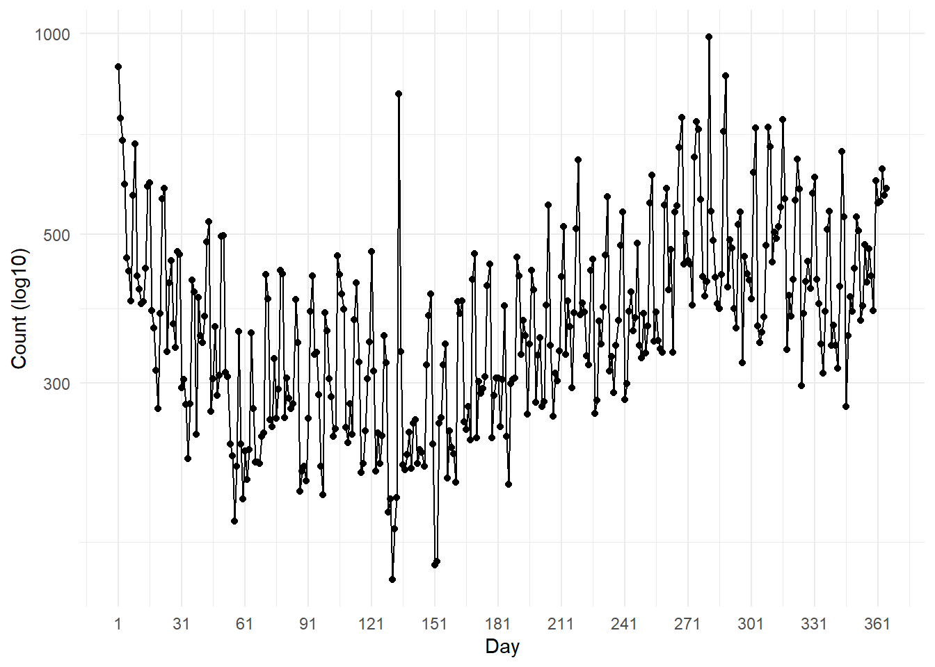
The same method above can be used to group record counts by week4.
Code
birds_week <- birds_date |>
  filter(year(eventDate) == 2022) |>
  mutate(
    week = week(eventDate)) |>
  group_by(week) |>
  summarise(count = n())

ggplot(birds_week, aes(x = week, y = count)) +
  geom_line() +  # Add lines
  geom_point() + # Add points
  labs(x = "Week", y = "Count") +
  scale_x_continuous(breaks = seq(1, 52, by = 4)) +
  theme_minimal()  # Set a minimal theme
Our temporal plots show that occurrences generally drop in the earlier months, then inflate in the later months of the year.
2.4 Summary
In this chapter we have provided a few ways to summarise your data taxonomically, spatially, and temporally. We hope that these code chunks will help you in summarising your own data. Summarising and visualising data are some of the most useful ways to spot errors for data cleaning. As such, we suggest using these tools often though the course of your analysis.
In the next part of this book, we will tackle these issues to clean your dataset.
The Coordinate Reference System (CRS) determines how to display our shape of Australia, which exists on a spherical globe (the Earth), onto a flat surface (our map).↩︎
Data from the ALA use EPSG:4326 (also known as “WGS84”) as the Coordinate Reference System. Transforming our map to the same projection of our data ensures the points are plotted in their actual locations on the map.↩︎
This is due to timezone conversion when the ALA standardises its data. There are several timezones across Australia, so although these points might have been in 2022, once converted they fell outside of 2022!↩︎
Notice, though, that we’ve ommitted the log scale because grouping by week has less variation in counts than by day (above).↩︎